For use across Colgate’s academic and administrative divisions, departments, and offices, the University Identity functions as the foundational design of visual components that all branches of the Colgate Identity Architecture originate. Thus, it serves to uplift and solidifies the core missions of the institution in attracting outstanding students and faculty, strengthening the academic enterprise, enriching the student experience, and improving the campus environs.
Background
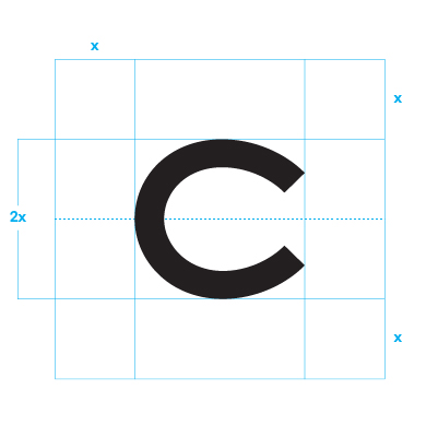
C Mark
The C mark is based on the letter C originally printed on the cover of the 1904 Salmagundi. This letter C, despite being created over a century ago, is remarkably modern in design. Its introduction into Colgate’s Identity reinforces the school’s respect for its heritage as it looks toward the future.

Wordmark
The Colgate wordmarks are set in Portrait, a typeface designed by Berton Hasebe in 2013. Portrait is based on French Renaissance proportions combined with chiseled serif details, making it a distinctively classical yet modern typeface. This typeface should not be used elsewhere, and should only appear on the official Colgate wordmark. This elevates the wordmark and makes it distinct from other surrounding texts.

Marks
C Mark
The C mark is a key element in the Colgate Identity. As such, it must be used consistently and appropriately. The C mark should be displayed prominently and clearly to maximize its impact. It is important to both display the mark with a clear space area around all four sides and adhere to the recommended color combinations in order to maintain consistency and integrity of the Colgate Identity.

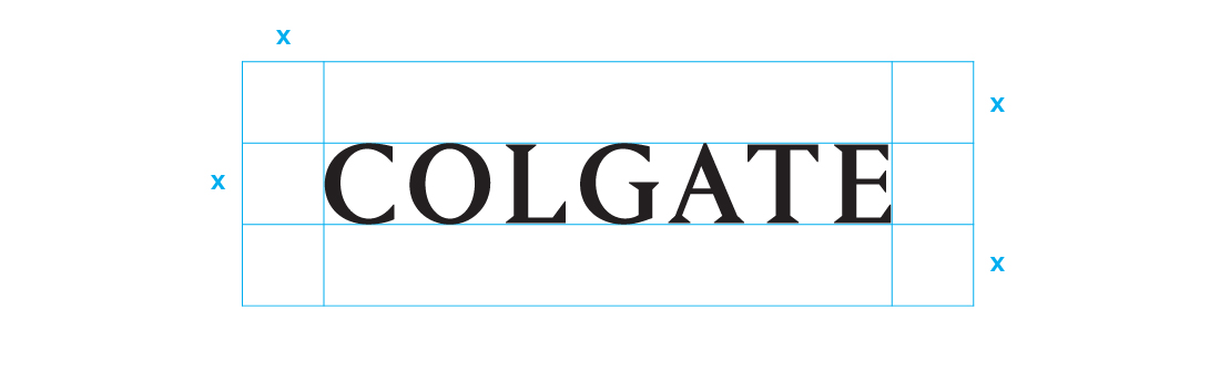
One-line Wordmark
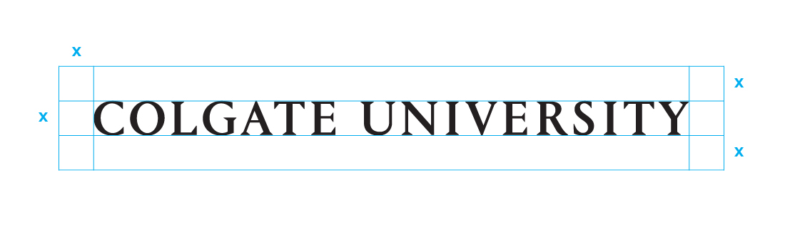
The “Colgate University” wordmark comes in two configurations: one-line and two-line. The one-line
configuration is the preferred way of displaying our name.
The wordmark has been set with particular letter spacing and should not be recreated by simply typing it out. When used as a mark, the official vector artwork should be used.
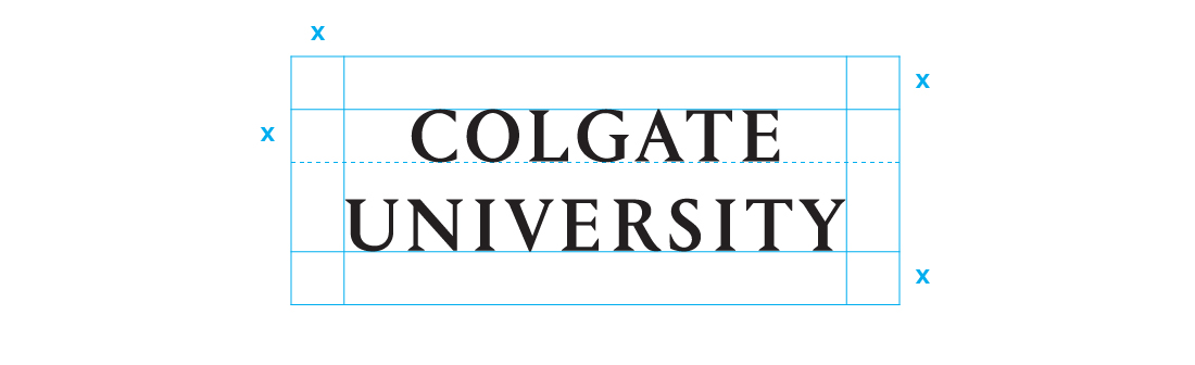
All versions of the Colgate wordmark should be displayed prominently and clearly to maximize their impact. It is important to both display the wordmark with a clear space area around all four sides and adhere to the recommended color combinations in order to maintain consistency and integrity of the Colgate Identity.

Two-line Wordmark
The two-line wordmark configuration should be used when horizontal space is limited and the one-line variation is not legible.

Alternate Wordmark
In special cases, the wordmark can be reduced down to “Colgate” only, especially when communicating to an internal audience. This wordmark can be used on merchandise, signage, and promotional applications.

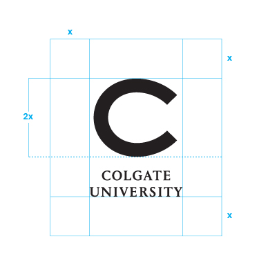
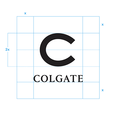
Lockup
It is always preferred that the C mark and wordmark appear on materials separately. If you choose to use them together, the lockup should be used. A lockup is the intentional arrangement of a mark and its accompanying elements. It is a fixed relationship that should not change. In this case, the lockup refers to the pairing of the wordmark and C mark.
All versions of the lockup should be displayed prominently and clearly to maximize their impact. It is important to both display the lockup with a clear space area around all four sides and adhere to the recommended color combinations in order to maintain consistency and integrity of the Colgate Identity.

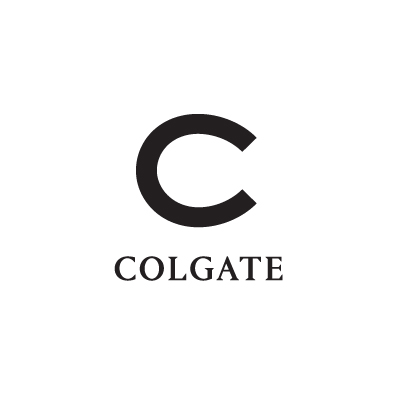
Alternate Lockup
In special cases, the lockup can be reduced down to “Colgate” alone, especially when communicating to an internal audience. This lockup can be used on merchandise, signage, and promotional applications.
Department Lockups
Lockups for different Colgate departments, programs, offices, and other entities are determined by the proportions of the wordmark.

A second line of text can be inserted with a capheight equal to 60% the capheight of the wordmark. It should always be written in title-case and set in Messina Sans Book. This configuration applies to additional lines of text, including sub-departments. Any department, in any capacity, associated with the University can adopt this configuration.
Don’t create alternate lockups or alter the relationships of the existing lockups. This includes changing the placement and typeface. Note: The “Colgate University” wordmark should not be recreated by simply typing it out. The official vector artwork should always be used.


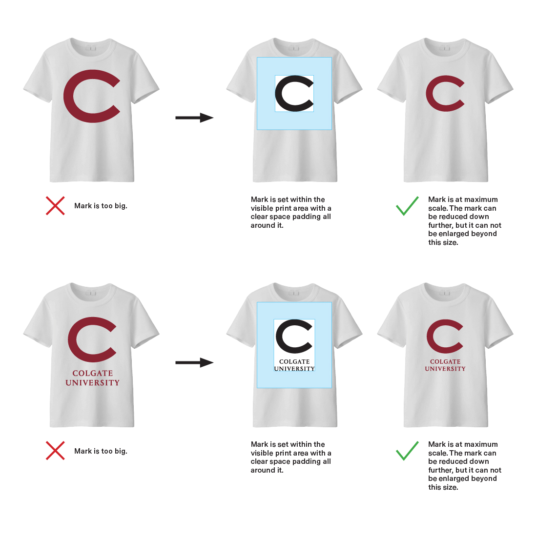
Sizing
Avoid the tendency to make the marks as big as possible, and make sure to leave ample space around each mark. In most cases, the marks should be used as an endorsing element, rather than as a primary graphic element. Certain exceptions can be made (such as on banners) with the approval of the Office of University Communications.