The following set of core elements enrich the Colgate identity by allowing creative flexibility while maintaining a consistent and identifiable appearance across a wide range of applications.
Typography
The official typeface of Colgate University is Messina. There are two primary categories in the Messina family: Messina Serif and Messina Sans.
The typeface was designed by Luzi Gantenbein in 2015. Messina Serif is based on 17th-century French Renaissance proportions, while Messina Sans reflects the minimalist affinity of the 20th century. Contemporary typographic details integrate a modern sensibility into both typefaces.
Messina Should be used for all supporting type on Colgate materials. Both the Serif and Sans versions can be used in text or display sizes. Other categories of the Messina family (Modern, Condensed, and Mono) are not part of the Colgate identity and, therefore, should not be used on any official communication materials.
Messina should be used whenever possible in communicating about Colgate. All university communicators have access to the official fonts.
For non-Colgate affiliates, font files can be purchased at the following online font provider:
Luzi Type (~$300 USD for Messina Serif and Messina Sans individually)
Messina Serif
A B C D E F G H I J K L M N O P Q R S T U V W X Y Z a b c d e f g h i j k l m n o p q r s t u v w x y z 0 1 2 3 4 5 6 7 8 9 @ # ? & $ % ⅓ ; : ”
Light
Book
Regular
Semibold
Bold
Messina Sans
A B C D E F G H I J K L M N O P Q R S T U V W X Y Z a b c d e f g h i j k l m n o p q r s t u v w x y z 0 1 2 3 4 5 6 7 8 9 @ # ? & $ % ⅓ ; : ”
Light
Book
Regular
Semibold
Bold
Black
Alternate Typefaces
We strongly recommend using the identity typefaces in all circumstances. However, when this is not possible, Times New Roman may be used in place of Messina Serif, and Arial may be used in place of Messina Sans.
Typographic Styling
- Messina Book, Regular, and Bold weights should be used primarily. Other weights can be used when appropriate.
- When setting ragged left typography, it’s important to take the time to balance the ragged edge of the text as effectively as possible.
- Only adjust letter spacing if it improves readability. Expanding or condensing the space between characters is known as kerning.
- Leading is the space between lines of text. When setting the leading for body text, ensure the leading size is larger than the type size, and the text reads comfortably.
- Text is read most comfortably when set in a line length of 40 to 65 characters.
- We strongly recommend using the identity typefaces, Messina Serif and Messina Sans, in all circumstances. However, when this is not possible, Times New Roman may be used in place of Messina Serif, and Arial may be used in place of Messina Sans.
- There are a variety of ways to create contrast between text elements by using just two typefaces. No matter which combinations of typefaces you choose, always use contrasting weights and sizes to create a hierarchy of information.
- Information can be emphasized in a variety of ways by using devices such as color, contrast, composition, weight and underlining. Avoid using too many methods together as this will simply confuse the layout and make the message less effective.
Color Palette
Inspired by Colgate’s history and sense of place, the color palette is a robust system capable of illustrating a variety of expressions. A precise and controlled use of the color palette is the key to creating a sense of visual consistency and sophistication across the Colgate identity.
Primary Color
Officially adopted in the spring of 1900 by the Students’ Association and faculty, Colgate maroon is the primary color of the University and should always be the most dominant color.
Colgate Maroon
- PMS 202 C
- PMS 202 U
- RGB 135 / 30 / 45
- HEX 821019
- CMYK 0 / 98 / 58 / 44
Secondary Colors
Maple red, night black, shadow gray, mid gray, and winter gray are secondary colors, and should always be paired with maroon.
Maple Red
- PMS 199 C
- PMS 199 U
- RGB 225 / 0 / 40
- HEX E10028
- CMYK 0 / 95 / 80 / 0
Dark Maroon
- PMS 2449 C
PMS 2449 U - RGB 65 / 18 / 23
- HEX 411217
- CMYK 28 / 89 / 60 / 77
Night Black
- RGB 0 / 0 / 0
- HEX 000000
- CMYK 0 / 0 / 0 / 100
Shadow Gray
- PMS 431 C
- PMS 431 U
- RGB 90 / 100 / 110
- HEX 5A646E
- CMYK 20 / 5 / 0 / 70
Mid Gray
- PMS 429 C
- PMS 429 U
- RGB 160 / 165 / 170
- HEX A0A5AA
- CMYK 35 / 23 / 19 / 2
Winter Gray
- PMS 427 C
- PMS 427 U
- RGB 210 / 212 / 214
- HEX D2D4D6
- CMYK 5 / 0 / 9 / 11
Tertiary Colors
When color beyond the primary and secondary colors is needed for distinction, the tertiary colors can be used sparingly.
Summer Green
- PMS 369 C
- PMS 369 U
- RGB 100 / 165 / 10
- HEX 64A50A
- CMYK 70 / 0 / 100 / 0
Shaded Green
- PMS 3298 C
- PMS 3298 U
- RGB 0 / 95 / 70
- HEX 005F46
- CMYK 100 / 0 / 60 / 40
Autumn Yellow
- PMS 130 C
- PMS 129 U
- RGB 240 / 170 / 0
- HEX F0AA00
- CMYK 0 / 30 / 100 / 0
Autumn Orange
- PMS 1585 C
- PMS 1585 U
- RGB 255 / 105 / 20
- HEX FF6914
- CMYK 0 / 60 / 100 / 0
Sky Blue
- PMS 639 C
- PMS 639 U
- RGB 0 / 150 / 200
- HEX 0096C8
- CMYK 100 / 0 / 5 / 5
Lake Blue
- PMS 301 C
- PMS 301 U
- RGB 0 / 70 / 130
- HEX 004682
- CMYK 100 / 50 / 0 / 20
Color Proportions
A precise and controlled use of the color palette is the key to creating a sense of visual consistency and sophistication across the Colgate Identity.
Maroon should be the most dominant color. Maple red serves as a highlight color for adding vibrancy and emphasis. Tertiary colors should only be used if necessary, and applied sparingly.
Whenever possible, use these recommended ratios as a guide to applying the color palette. Please note percentages are approximate and color ratios may differ depending on usage.
Imagery
Photography
Photography, videography, and illustrative storytelling are powerful ways to showcase the beauty and distinctive experience of being at Colgate.
Art and photography should reflect the tone and personality of Colgate. It should:
- Be bold, optimistic, proud, beautiful, and energetic; and when possible, show a sense of community, gravitas, rigor, unity, tradition, and ambition.
- Capture genuine moments of activity and human interaction.
- Make use of unique perspectives, compositions, and lighting.
- Display the beauty of Colgate’s landmarks and the surrounding Hamilton landscape.
- Highlight images that show a diversity of fields, student collaboration, professor-to-student relationships, and hands-on, experiential learning.
- Utilize student, alumni, and local talent whenever possible.
- Avoid shots that are posed, inauthentic, and cliché, and avoid the heavy use of filters and effects.


Colgate Photo Galleries
Showcasing its exceptionally beautiful campus and unique happenings, a curated photo gallery of images taken by Colgate photographers is available for use in communicating the Colgate experience.
Illustration
Though photography is the preferred form of imagery for most Colgate communications, when illustration is needed, the choice of illustration should reflect the tone and personality of Colgate: It should be bold, optimistic, proud, beautiful, and energetic. It should embody the gravitas of the University.
The style of illustration should feel timeless, but not old-fashioned, and contemporary but not trendy. When possible, use the Colgate color palette in the illustration.
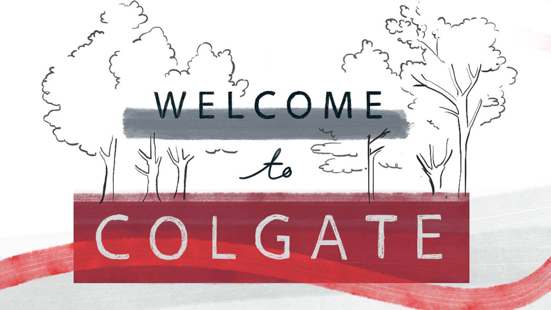
Illustration by Scriberia

Illustration by Anje Jager

Illustration by Rebecca Clarke

Illustrations by Toby Triumph
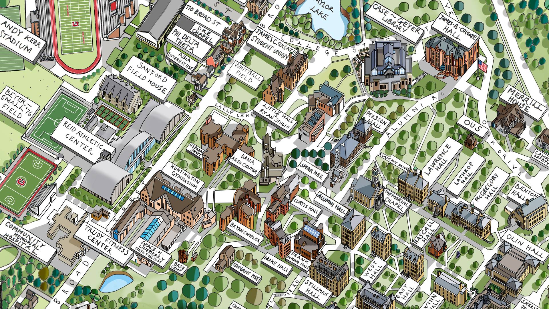
Illustration by Katherine Baxter

Illustration by Hanna Barczyk
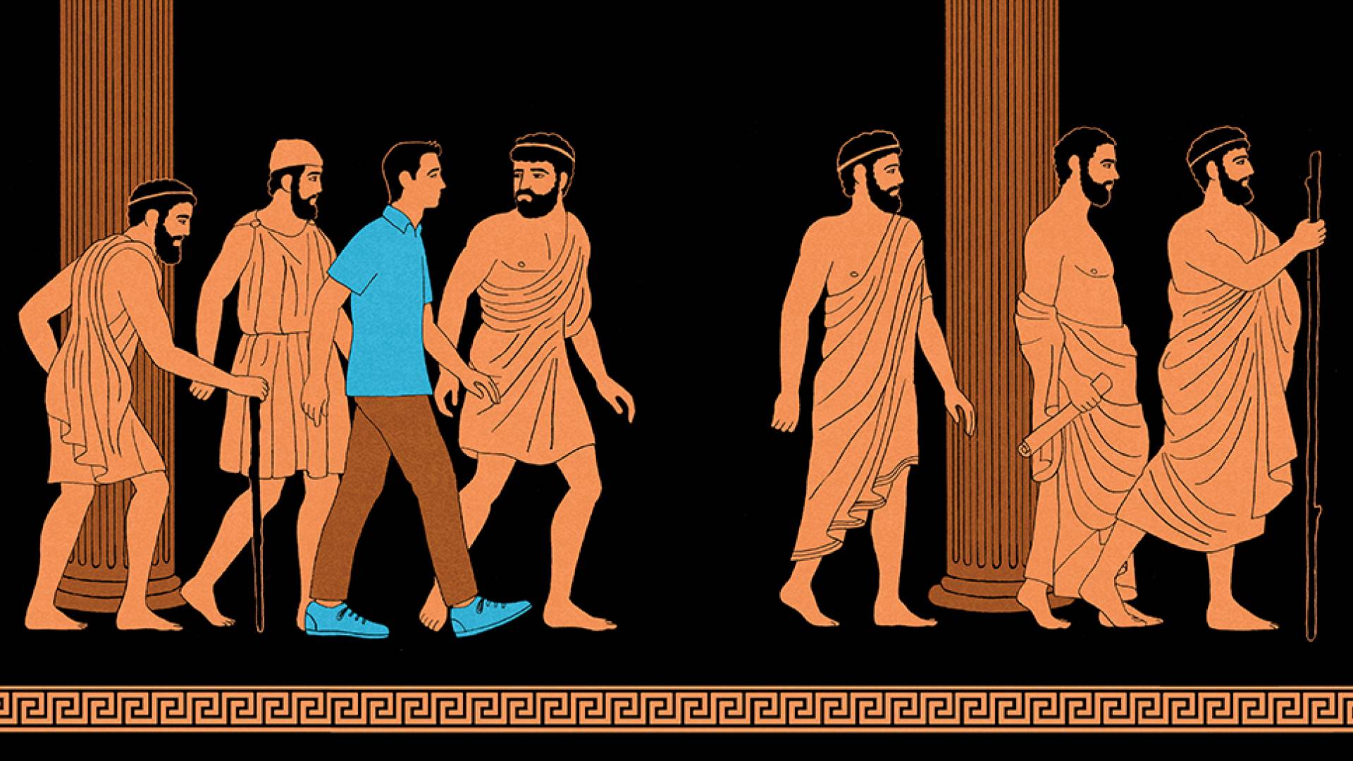
Illustration by James Steinberg

Illustration by Delphine Lee
Campus Illustration
The official illustration of the University is a traditional watercolor depiction of Colgate’s landscape. It captures natural and architectural features as well as the beauty and scale of the campus. It was created by illustrator Sarah Maycock.
The illustration can be softened with an 80% tint (or lighter) when used on applications.

Patterns
Patterns may be used in applications that require further expression of the University Identity. These examples here celebrate Colgate traditions while capturing the energy, gravitas, and rigor of the campus.
Always use the provided pattern swatches — do not alter or recreate them. Only the colors may be changed. Colors used on these patterns should adhere to the Colgate color palette.
The “Colgate Hello” pattern may be used in applications that require further expression of the
Supporting Identities.
Colgate 13 Stripes
The 13 stripes are made up of any of the colors in the secondary teir of the Colgate color palette as long as they equal the number 13. These patterns are available on the Colgate Visual Identity Drive on Google, or please reach out to Colgate’s Communication Department for more information.


Iconography
Icons can improve key messages and navigation by quickly attracting attention to specific actions audiences should take. Applying iconography is a tool to assist audiences with the process of information absorption. Therefore, icons should be rendered with simplicity and used with intention. For versatility, Colgate utilizes two icon treatments: line and solid. When applying icons, use a consistent treatment within the same layout.
Existing icon sets can be accessed, and new icons can be created by contacting the Office of University Communications at creative@colgate.edu.
Contact Communications
For guidance in utilizing the University’s visual identity; access to logo, wordmark, and lockup files; and more, contact the creative team in Colgate’s Office of University Communications:
creative@colgate.edu


